ASS标签
The following is a list of every tag supported by the Advanced Substation Alpha format. This is basically a detailed version of ass-quickref.txt. See the tutorial for an introduction to typesetting, using some basic tags.
下面列出所有ASS格式支持的标签。这基本上算是ass-quickref.txt的一个详细版本。你可以在本教程手册的排版教程获取关于使用一些基本标签来排版文本的教程。
特殊符号
The following tags are written in the middle of the text, and not inside override blocks (i.e. not between { and }).
下列标签写在文本中,而不是特效区域中(即不在 { 和 } 中)。
软换行(软空格)
\n插入一个强制换行符,但是只在换行方式2下生效(参阅\q标签)。注意这是一个小写的 n。
In all other wrapping modes, this is replaced by a regular space. This is rarely (if ever) actually useful. If you’re not sure whether you want this or \N, you probably want \N.
在所有其他的换行方式下,它被当作一个空格对待。这个真的不常用(即使用过)。如果你不确定你想要的效果的是 \n 还是 \N ,那么十有八九是 \N。
硬换行符
\N插入一个强制换行符,在所有换行方式下都生效。注意这是一个大写的 N。
硬空格
\h插入一个不换行的"硬"空格。句子将不会在硬空格处自动换行,并且当硬空格出现在一行的开头或者结束的地方,也不会被忽略(Aegisub 排版引擎一般会忽略换行处的空格)。
特效标签
Override tags must appear within override blocks, which begin with { and end with }. Any unrecognized text within override blocks is silently ignored, so they are also commonly used for inline comments. Mixing comments and override tags in the same override block is not recommended.
特效标签必须出现在特效标签区里,也就是开始于 { 而且结束于 }。特效标签区里面不被识别的文本会被自动忽略,所以它们也经常用于内联注释,不推荐在一个特效标签区中同时出现特效标签和注释。
Tags fall into two general categories: those which set a property of the line
itself, and those which modifiy only the text following them. \pos, \move,
\clip, \iclip, \org, \fade and \fad are those in the first category;
all others are in the second. Tags in the first category should appear at most
once in a line, and where in the line they appear is unimportant. In addition,
some of them are mutally exclusive: \pos and \move; \clip and \iclip;
\fad and \fade. The result of inluding multiple instances of these tags or
mutally exclusive tags will vary between renderers and is not recommended.
标签基本分为两类:一种是定义整行的属性,另一种就是仅修饰跟在它后面的文本。\pos,
\move, \clip, \iclip, \org, \fade 和 \fad
这些是第一类的,其他剩下的就是第二类了。第一类标签在一行中应当至多出现一次,并且在这一行中,写在什么位置都行。另外,他们当中的某些是互斥的,比如:\pos
和 \move; \clip 和 \iclip;\fad 和
\fade。根据诸多实例,包含多个标签或者互斥标签会根据渲染器的不同而产生各种奇葩的效果,所以不推荐这么做。
Tags in the second category modify all text after the tag until the end of the line or until the property is re-overridden by another tag.
第二类标签会修饰后面的所有文本,直到这一行结束或者样式被其他标签重写。
Override tags always follow the same form: They start with a backslash
character, then a name, and after the name the parameter to the tag. If the
parameter is omitted, the default value from the line’s style is used.
特效标签通常遵循相同的形式:它们开始于反斜杠 \,然后是特效名称,再后面就是标签的参数。如果参数为空,那么就会使用这一行样式的默认值。
Some tags are “complex” and take more than one parameter. In these cases, parameters are put inside parentheses with commas between the parameters.
有一些标签比较"复杂"并且需要多个参数。在这种情况下,参数们就会被放到一个小括号里并且用逗号分隔开。
Note on typography:
关于示例格式:
On this page, everything written in italics with < angle brackets >
around it is a parameter and you must enter a value instead of it. The angle
brackets are not part of the value you should enter. Use the examples as a
guide to how the tags should be entered. In general, the same rules apply to
all tags in how they look.
在这一页,所有在 <尖括号> 中的 斜体
文字都是参数,需要你用数值代替。尖括号不需要输入,直接输入数值即可。下面的例子将引导你来了解如何设定这些标签的参数。通常情况下,在它们的外观上,相同的规则应用于所有的标签。(译者注:这里的规则指的应该就是数值要写在标签的后面)
斜体
\i1
\i0\i1 to enable italics for the following
text and \i0 to disable italics again.打开或关闭 斜体
选项。利用\i1对后面的字符应用斜体,并且可以用\i0使后面的字符取消斜体。
粗体
\b1
\b0
\b<weight>\b1 to enable boldface for the
following text and \b0 to disable boldface again.打开或关闭 粗体
选项。利用\b1对后面的字符应用加粗,并且可以用\b0使后面的字符取消加粗。
The \b<weight> form allows you to specify an
explicit weight to use. Note that most fonts only support one or two weights
so you rarely need to use this. Font weights are multiples of 100, such that
100 is the lowest, 400 is “normal”, 700 is “bold” and 900 is the heaviest.
这个 \b<字重>
形式允许你具体使用一个字重值。注意大多数字体仅支持一到两个字重,所以这种用途并不常见。字重值都是100的倍数,例如:100是最细,400是"normal",700是"bold",900是最粗。
I am {\b1}not{\b0} amused.
The word “not” is written in boldface.
其中"not"就是用的粗体。
{\b100}How {\b300}bold {\b500}can {\b700}you {\b900}get?
The words are written with increasingly greater weight. Note that most fonts do not have more than one or two different weights and you will only be able to see “not bold” and “bold” in that case.
这些单词是逐渐加粗的。注意,大部分字体没有超过一到两个不同的字重值,所以那种情况下你只能看到"未加粗"和"加粗"两种效果。
下划线
\u1
\u0\u1 to enable underlining for
the following text and \u0 to disable underlining again.打开或关闭 __下划线
选项。利用\u1对后面的字符应用下划线,并且可以用\u0使后面的字符取消下划线。
删除线
\s1
\s0\s1 to enable strikeout for
the following text and \s0 to disable strikeout again.打开或关闭 删除线
选项。利用\s1对后面的字符应用删除线,并且可以用\s0使后面的字符取消删除线。
边框宽度
\bord<size>改变字符周围边框的宽度。把size设为0可以使边框完全消失。
If “scale border and shadow” (see script properties) is enabled, the value is given in script resolution pixels, otherwise it is given in video resolution pixels (which means the border thickness will vary depending on the resolution of the video on which the subtitles are rendered.)
如果"比例缩放边框和阴影"(详见 脚本配置)是选中的,边框宽度值将取决于脚本的分辨率,否则会由视频的分辨率决定(也就是说边框的宽度会自适应使用该字幕的视频)。
The value is not limited to whole integer pixels and can have decimal places. Border width cannot be negative.
宽度值不必须是整数。它也可以是小数,但不能是负数。
\bord0
Disable border entirely. 完全隐藏边框。
\bord3.7
Set the border width to 3.7 pixels 设置边框宽度为3.7个像素
边框宽度 (补充)
\xbord<size>
\ybord<size>\xbord \ybord tags to set the border size in X and Y direction
separately. This can be useful for correcting the border size for anamorphic
rendering of subtitles.用\xbord
\ybord标签来分别设置X方向和Y方向上的宽度值。这个可以用来修正渲染时失真的字幕。
Note that if you use \bord after \xbord or \ybord on a line, it will
override both of them.
注意,如果你在同一行中先用
\xbord或者\ybord,然后用\bord,它会忽略前面这两个标签。
You can set the border width to 0 (zero) in one of the directions to entirely disable border in that direction.
你可以把某个方向上的边框宽度设为0,这个方向的边框就完全消失。
阴影距离
\shad<depth>设置字符与阴影间的距离。设置深度为0使阴影完全消失。其他方面和边框宽度\bord的设置相似。
The shadow distance can not be negative with this tag.
阴影距离也不能设置为负数值。
阴影距离 (补充)
\xshad<depth>
\yshad<depth>分别设置阴影在X方向和Y方向与字符的距离。阴影只会在X和Y方向上均为0时才会消失。
Note that unlike \shad, you can set the distance negative with these tags to position the shadow to the top or left of the text.
注意它和\shad不同,你可以设置距离值为负数让阴影显示在字符的上方或者左方。
边框模糊
\be0
\be1
\be<strength>应用或取消一个字符边缘柔化的效果。这个效果并不总是很明显,但是有些时候会让字符看起来更舒服。这个效果在字符比较小的时候一般会更明显。
Be aware that this tag blurs the edges of the text, not everything. This means that if the text has a border (set with \bord) the border will be blurred, but if there is no border, the main text will be blurred instead.
注意这个标签只会模糊文本的 边框 ,不是整体。也就是说,如果文本有边框 (边框设置详见 \bord) 那么边框将会被模糊,但是如果没有边框,那么文本整体就会被模糊。
In the extended version, strength is the number of times to apply the
regular effect. Note that at high values the effect de-generates into
nothingness, and generally isn’t very useful. For strong blurs, \blur is
generally more useful as a result. The strength must be an integer number.
在新的版本里, strength
是循环叠加效果的次数。注意数值给的比较大的时候就会把边框整个糊掉,并且通常情况下并没有什么卵用。对于高强度模糊,\blur通常结果更有用。
strength 必须是一个整数。
边缘模糊 (高斯函数)
\blur<strength>\be tag, but
uses a more advanced algorithm that looks better at high strengths. Unlike
\be, the strength can be non-integer here. Set strength to 0 (zero) to
disable the effect. Be careful, setting strength too high can take a lot of
CPU time to render.通常来说,这个标签和`\be`标签的功能相似,但是它使用了一个更高级的算法让它在高强度上看起来更好。和\be不一样,这个
strength 可以不是整数。设置 strength 为0使模糊效果消失。小心点,把
strength 设置的太高的话,渲染时会占用大量 CPU 时间。
Be aware that this tag blurs the edges of the text, not everything. This
means that if the text has a border (set with \bord) the
border will be blurred, but if there is no border, the main text will be
blurred instead.
注意,这个标签会模糊文本的 边框 ,不是全部。也就是说,如果文本有边框(用`\bord`标签进行设置),那么边框会被模糊,但是如果没有边框,那么文本的主体就会被模糊。
字体名称
\fn<字体名称>\fn and the font name, and you should not put parentheses or similar
around the font name either.设置其后字符的显示字体。在\fn和字体名称之间不能有空格,字体名称两边也不应当有括号或类似的东西。
\fnArial
The text following this tag will be in Arial font.
标签后的字符将会以 Arial 字体显示。
\fnTimes New Roman
The text following this tag will be in Times New Roman font.
标签后的字符将会以 Times New Roman 字体显示。
字体大小
\fs<大小>设置字体的大小。指定的大小值是按脚本像素计算的高度,即40的大小值意味着字符的行高是40像素。(技术性备注:这个值实际上是排版(桌面印刷)中的点,而不是脚本像素。但是由于渲染总在72 DPI(事实标准)下进行,最终一个脚本像素是等价于一个点的。
You can only specify integer font sizes.
字体的大小值必须是整数。
\fs10
The following text will use a size 10 font.
其后字符的字体大小值将是10。
Font scale
\fscx<scale>
\fscy<scale>\fscx or Y (\fscy) direction. The
scale given is in percent, so 100 means “original size”.This is not the same as setting the font size, as setting the size is subject
to font hinting while scaling the
text modifies the text shape after hinting. As a result, this should always be
used with \t rather than \fs, as animating changing font hinting is very
rarely desirable.
这个标签和设置字体大小并不相同,设置字体大小的结果会受到
字体微调
的影响。而字体变形是对原始字形的变形(过程中不会受到字体微调的影响)。所以在与
\t 搭配使用时,一般应使用本标签而不是
\fs,因为有字体微调参与的变形效果通常都不怎么好看。
(译者注:字体微调,是对不同字号(即字体大小)的字形进行细节调整,优化其显示效果的技术。经过字体微调后,同一字符(同一字体同一字重的)不同字号的字形之间不再是严格的相似关系,变形效果会很差。所以在不同字体大小之间变形时,不能使用字体原本提供的不同大小的字形,而是仅使用一个大小的字形,用字体变形标签对其进行缩放。
These tags also affect vector drawings.
这两个标签也会影响矢量绘图。
You can use font scaling to correct for anamorphic rendering and to specify text size more precisely than with \fs.
字体变形可以用来修正错误的渲染,也可以比 \fs 更准确的指定字体大小。
Note that older versions of VSFitler will truncate non-integer scales.
注意旧版的 VSFitler 会忽略非整数参数的小数部分。
\fscx150
Make the text 50% wider than normal.
其后的字符会比正常的宽50%。
\fscy50
Make the text half height.
其后的字符只有正常的一半高度。
\fscx200\fscy200
Make the text double size.
其后的字符字体大小会变为正常的两倍。
Letter spacing
\fsp<spacing>改变两个字符的间距。使用这个标签可以让文本散的更开。 spacing 是按脚本分辨率计算的
Spacing can be negative and can have decimals.
间距可以是负值,也可以含有小数。
文本旋转
\frx<amount>
\fry<amount>
\frz<amount>
\fr<amount>\fr tag is a shortcut for \frz.沿 X,Y,Z 轴旋转文本。\fr标签是\frz的简写。
- The X axis runs horizontally on the screen. Rotating on it (with positive values) causes an effect where the top of the text moves farther “into” the screen while the bottom moves “out” of the screen.
- The Y axis runs vertically on the screen. Rotating on it (with positive values) causes the text to rotate so that the left moves “outside” the screen, when the right moves “into” the screen.
- The Z axis runs perpendicular to the screen. Rotating on it (with positive values) causes the text to rotate in 2D, counterclockwise (as standard for degrees).
- X 轴在屏幕平面上,沿水平方向。沿 X 轴旋转(角度为正数时)会让文本的顶部看起来"陷"到屏幕里面,而底部"凸"出来。
- Y 轴在屏幕平面上,沿竖直方向。沿 Y 轴旋转(角度为正数时)会让文本的右边看起来"陷"到屏幕里面,而左边"凸"出来。
- Z 轴垂直于屏幕平面。沿 Z 轴旋转(角度为正数时),文本会在屏幕平面内逆时针旋转(单位以角度计)。
The rotation amount is given in mathematical degrees, such that 360 degrees is a full rotation, and rotating any multiple of 360 is the same as not rotating. It is legal to specify negative rotation amounts, as well as amounts larger than 360 degrees.
旋转参数 amount 以数学上的角度给出。如360度意味着转一整圈,转360度的倍数相当于没转。旋转角度可以使用负值和大于360度的值。
The rotation is performed around the subtitle line origin point, this is described with the \org tag.
旋转的中心是当前字幕行的原点,这个点由 \org 规定。
These tags also affect vector drawings.
这几个标签也会影响矢量绘图。
\frx45
Rotate the text 45 degrees on the X axis. 把文本沿 X 轴方向旋转45度。
\fry-45
Rotate the text 45 degrees in opposite direction on the Y axis. 把文本沿 Y 轴反方向旋转45度。
\frz180
Rotate the text 180 degrees on the Z axis, making it upside-down. 把文本沿 Z 轴旋转180度,即上下翻转。
The following two rotations produce the same result: 下面两个旋转效果相同:
\frz-30
\frz330
This is because 330 degrees is 30 degrees less than a full rotation of 360 degrees. 因为330度比旋转一圈刚好少30度。
The following screenshots illustrate the effect of rotating on the different axes: 下面几个图演示了沿不同轴旋转的效果。


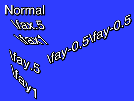
文本剪切变换
\fax<factor>
\fay<factor>对文本应用一个剪切变换。factor 为0即意味着不做变换。
Usually factor will be a small number; values outside the range -2 to 2 are unlikely to have desireable results.
通常 factor 是一个比较小的数,其值如果超过 [-2, 2] 范围的值,效果一般都不是很好。
Shearing is performed after rotation, on the rotated coordinates. The coordinate system used for shearing is not affected by the rotation origin.
剪切是在旋转之后应用的,以旋转后的坐标系为基准。这个剪切用的坐标系不受 旋转中心 的影响。
字体字符集
\fe<id>设定用于选择字符映射表的字体字符集,字符映射表描述了从 Unicode 码位到字体内含的字形索引的映射。一些字体没有 Unicode 字符映射表,就或许会需要指定字符集,才能正常显示特定语言的字符。对于包含 Unicode 字体映射表的字体,指定字符映射表可以达到同一字符在不同语言中显示不同字形的效果,如有些汉字在简繁中文和日韩语中字形是不同的。
Some common font encoding IDs are:
一些常用的字体字符集 ID:
- 0 - ANSI, Windows CP-1252 for Western-European languages.
- 1 - Default, depends on the configuration of the user’s system, but also allows the font sub-system to dynamically pick a different mapping table in some circumstances.
- 2 - Symbol, codepoints in the 0-255 range are translated to per-font defined symbol glyphs, this is used for fonts such as Wingdings.
- 128 - Shift-JIS, used for Japanese.
- 129 and 130, respectively Hangeul and Johab, two encoding schemes for Korean.
- 134 - GB2312, used for Simplified Chinese.
- 136 - BIG5, used for Traditional Chinese.
- 162 - Turkish.
- 163 - Vietnamese.
- 177 - Hebrew.
- 178 - Arabic.
- 0 - ANSI,Windows CP-1252,西欧语言。
- 1 - 默认,视用户操作系统的配置而定,但也允许字体子系统视情况选择一个不同的字符映射表。
- 2 - 符号,码位的取值范围是 [0, 255],显示效果视具体字体而定,像 Wingdings 这样的装饰字体应该用这个ID。
- 128 - Shift-JIS,日语。
- 129 and 130,分别是 Hangeul 和 Johab,韩语的两个字符集。
- 134 - GB2312,简体中文。
- 136 - BIG5,繁体中文/正体中文。
- 162 - 土耳其语。
- 163 - 越南语。
- 177 - 希伯来语。
- 178 - 阿拉伯语。
A more complete list can be seen the style editor dialog box.
样式编辑器对话框有更全面的列表。
In ASS files stored in non-Unicode encodings, this tag also affects what codepage the text following it should be interpreted in. Aegisub doesn’t support this use and some renderers might not support it either. It is recommended you do not rely on this and instead always store your files in a Unicode encoding. (Aegisub stores files in Unicode UTF-8 by default.)
当以非 Unicode 编码存储 ASS 时,这个标签会指定其后的字符显示时所使用的字符映射表。Aegisub 不支持这个用法,一些渲染器可能也不支持。所以建议你不要依赖这个功能,而是始终以 Unicode 编码保存 ASS 文件。(Aegisub 保存 ASS 文件的默认编码是 UTF-8)
设置颜色
\c&H<bb><gg><rr>&
\1c&H<bb><gg><rr>&
\2c&H<bb><gg><rr>&
\3c&H<bb><gg><rr>&
\4c&H<bb><gg><rr>&\c tag is an abbreviation of \1c.设置其后字符的颜色。\c 标签是 \1c 的缩写。
\1csets the primary fill color.\2csets the secondary fill color. This is only used for pre-highlight in standard karaoke.\3csets the border color.\4csets the shadow color.\1c设置主要填充颜色。\2c设置次要填充颜色。这个仅会在标准卡拉OK 的预填充时使用。\3c设置边框颜色。\4c设置阴影颜色。
The color codes are given in
hexadecimal in Blue Green Red
order. Note that this is the opposite order of HTML color codes. Color codes
must always start with &H and end with &.
颜色代码要以十六进制填写,顺序是蓝、绿、红。注意这个顺序和 Web
颜色的顺序是相反的。颜色代码必须以&H开头,以&结尾。
The Pick Color toolbar buttons
![]() can
assist in picking colors and entering the color codes.
can
assist in picking colors and entering the color codes.
取色器工具栏按钮
![]() 可以帮助你选择颜色和填写颜色代码。
可以帮助你选择颜色和填写颜色代码。
设置透明度
\alpha&H<aa>
\1a&H<aa>
\2a&H<aa>
\3a&H<aa>
\4a&H<aa>\alphasets the alpha of all components at once.\1asets the primary fill alpha.\2asets the secondary fill alpha. This is only used for pre-highlight in standard karaoke.\3asets the border alpha.\4asets the shadow alpha.\alpha一次设置以下4个部分的透明度。\1a设置主要填充透明度。\2a设置次要填充透明度。这个仅会在标准卡拉OK 的预填充时使用。\3a设置边框透明度。\4a设置阴影透明度。
An alpha of 00 (zero) means opaque/fully visible, and an alpha of FF (ie. 255 in decimal) is fully transparent/invisible.
alpha 值为00意味着完全不透明,而为FF(十进制的255)即为完全透明。
\alpha&H80&
Set the alpha of all components to hexadecimal 80, decimal 128, making the text 50% transparent in general.
设置所有元素的透明度为十六进制的80,即十进制的128,各元素的透明度都是50%。
\1a&HFF&
Set the primary fill alpha to hexadecimal FF, decimal 255, making it invisible and effectively leaving only the border and shadow.
设置主要填充透明度为十六进制的FF,十进制的255,即完全不透明。这时只能看见边框和阴影。
行对齐方式
\an<pos>选择行的对齐方式。如果没有设定 位置 或 移动 ,对齐方式决定了行的位置。如果设定了位置或移动,对齐方式决定了位置和移动的参考点。
The \an tag uses “numpad” values for the pos, ie. the alignment values
correspond to the positions of the digits on the numeric keypad on a regular
keyboard:
\an 标签的 pos
参数使用小键盘布局,其值可以取小键盘上的数字,对应的位置就是该数字在小键盘上的相对位置。
- Bottom left
- Bottom center
- Bottom right
- Middle left
- Middle center
- Middle right
- Top left
- Top center
- Top right
- 屏幕左下角
- 屏幕底部中间
- 屏幕右下角
- 屏幕中间左侧
- 屏幕正中央
- 屏幕中间右侧
- 屏幕左上角
- 屏幕顶部中间
- 屏幕右上角
行对齐方式 (传统)
\a<pos>\an in new scripts instead, as it is more intuitive.使用源自 SubStation Alpha 的旧行对齐标签。Aegisub
支持这个标签,但是也在考虑抛弃它。你一般应当使用新的标签
\an,因为那更加方便。
The exception is that \a6 should be used for lazy sign translating, because
if you’re going to be lazy you should do it right and save the extra character.
有一种说法是,使用 \a6
可以更省事的把屏幕字无脑放顶端,这样你就不需要多输入一个字母(\an7)了。
Calculate pos as follows: Use 1 for left-alignment, 2 for center alignment and 3 for right-alignment. If you want sub-titles you’re done. To get top-titles, add 4 to the number, to get mid-titles add 8 to the number:
这样来记忆 pos 参数:1是左下角,2是底部中间,3是右下角。这就是底部的对齐了,然后如果你想在屏幕顶部对齐,那就都加4,如果想在中间就都加8。
- 1: Bottom left
- 2: Bottom center
- 3: Bottom right
- 5: Top left
- 6: Top center
- 7: Top right
- 9: Middle left
- 10: Middle center
- 11: Middle right
- 1:屏幕左下角
- 2:屏幕底部中间
- 3:屏幕右下角
- 5:屏幕左上角
- 6:屏幕顶部中间
- 7:屏幕右上角
- 9:屏幕中间左侧
- 10:屏幕正中央
- 11:屏幕中间右侧
卡拉OK 效果
\k<duration>
\K<duration>
\kf<duration>
\ko<duration>
Please note that these tags alone only create some very specific effects and all other effects are created with a combination of multiple different tags.
请注意,这些标签单独使用仅有非常有限的几个效果,所有其他的效果都是综合使用多种不同标签的结果。
The \k family of tags mark up subtitles for karaoke effects by specifying
the duration of each syllable. You place a \k tag before each syllable in
the line.
\k 标签家族标记出字幕中每个音节的持续时间,从而给字幕加上卡拉OK
效果。使用方法是在每个音节前加上 \k 标签。
The duration is given in centiseconds, ie. a duration of 100 is equivalent
to 1 second. You generally don’t enter \k tags manually but rather use
karaoke timing tools such as Aegisub’s karaoke mode.
duration 参数的单位是厘秒,一秒的百分之一。一般来说,\k 标签并不是手动输入的,而是用卡拉OK 计时工具创建,比如 Aegisub’s karaoke mode。
The different \k tags create various effects:
不同的 \k 标签有不同的效果:
\k: Before highlight, the syllable is filled with the secondary color and alpha. When the syllable starts, the fill is instantly changed to use primary color and alpha.\Kand\kf: These two are identical. Note that\Kis an uppercase K and is different from lowercase\k. The syllable fill starts out secondary color, when the syllable starts, the fill changes from secondary to primary with a sweep from left to right, so the sweep ends when the syllable time is over.\ko: Similar to\k, except that before highlight, the border/outline of the syllable is removed, and appears instantly when the syllable starts.\k:在这个音节开始之前,使用次要填充颜色和透明度。当这个音节开始时,立即变为使用主要填充颜色和透明度。\K和\kf:这两个标签相同。注意\K是大写的K,和小写的\k不同。在音节开始之前,使用次要填充颜色和透明度。当音节开始时,文本从左到右由次要填充颜色和透明度变为主要填充颜色和透明度,这个过程在音节结束时刚好结束。\ko:和\k类似,但是在音节开始之前,字符的边框会被移除。当音节开始时会立即出现。
Note: There is an additional karaoke tag, \kt, which is very different from
the other ones. It is rarely useful and Aegisub does not support that tag, so
it is not documented.
注意:还有一个额外的卡拉OK 标签,\kt。它和其他卡拉OK
标签十分不同。因为它很少用到,Aegisub 也不支持它,所以这里就不说他了。
换行风格
\q<style>决定在一个字幕行显示时如何换行。可以使用下列 style 参数。
- 0: Smart wrapping, make each line approximately equally long, but top line
wider when equal width is impossible. Only
\Nforces line breaks. - 1: End-of-line wrapping, fill as much text in a line as possible, then break
to next line. Only
\Nforces line breaks. - 2: No word wrapping, wide lines will extend beyound the edges of the screen.
Both
\nand\Nforce line breaks. - 3: Smart wrapping, similar to style 0, but bottom lines are made wider.
- 0:智能断行,尽可能让所有的行等长,不可能等长时选择让顶端的行宽一些。只有遇到
\N会强制换行。 - 1:行尾换行,尽可能填满一行,然后换行。只有遇到
\N会强制换行。 - 2:不换行,多余的字符会超过屏幕边缘。遇到
\n和\N都会强制换行。 - 3:智能换行,与参数1相似,但是会选择让靠近底部的行更宽。
重置样式
\r
\r<style>重置其后字符的样式,会让一切样式标签失效,包括动画效果。
The first form that does not specify a style will reset to the style defined for the entire line, while the second form, that specifies the name of a style, will reset the style to that specific style.
第一种形式没有指定 style 参数,它将会重设其后字符的样式为这一行的默认样式。第二种形式指定了一个具体的 style 值,即一种样式的名称,它会将其后字符的样式设定为指定的这个样式。
-Hey\N{\rAlternate}-Huh?\N{\r}-Who are you?
Assuming the current line style is “Default”, this has first “Hey” in the Default style, then follows on next line “Huh?” in the style “Alternate”, and on the third line the style is reset to “Default” for the “Who are you?” text.
假设这一行字幕的样式是"Default",那么开头的"Hey"就是 Default 样式,然后紧接着第二行的"Huh?“则是 Alternate 样式,然后后面第三行的"Who are you?“又被重设为 Default 样式。
位置设定
\pos(<X>,<Y>)设置一行字幕的位置。 X 和 Y 坐标必须是整数,按脚本分辨率计算。 X 和 Y 坐标的含义视 行对齐 的不同而略有差异。
The alignment of the subtitle line is used as anchor point for the position.
I.e. when you have a line with alignment top-left, the top-left corner of the
subtitle is placed at the coordinates given to \pos, and for bottom-center
alignment, the bottom center of the subtitle is placed at the coordinates
given.
字幕行的行对齐方式决定了位置设定的参考点。举例来说,当行对齐设定为左上时,字幕行的左上角会被放置在
\pos
指定的位置,对于底部中间对齐来说,字幕的底部中间位置将会被放置在指定的坐标上。
The following screenshots illustrate the way alignment affects positioning. The green cross marks the point (320,240) on the video.
下列屏幕截图说明了行对齐方式是如何影响位置设定的。绿色十字交叉点是视频的 (320, 240) 点。


移动设定
\move(<x1>,<y1>,<x2>,<y2>)
\move(<x1>,<y1>,<x2>,<y2>,<t1>,<t2>)\move tag works similar to \pos in that it
positions the subtitle line, the difference is that \move makes the subtitle
move.
\move 标签和 `\pos`
标签一样都指定字幕行的位置,但是与之不同的是,\move 还让字幕移动。The two versions of \move differ in that one makes the movement occur over
the entire duration of the subtitle, while on the other you specify the time
over which the movement occurs.
\move
的第一种形式的移动时间就是字幕的持续时间,第二种形式则允许你选择进行移动的时间范围。
The coordinates x1, y1, x2 and y2 are given in the script resolution
coordinate system, like \pos. The subtitle starts out at point (x1,y1)
and moves with constant speed so it ends up at (x2,y2).
Alignment influences movement coordinates the same
way as it influences \pos coordinates.
坐标 x1 , y1 , x2 和 y2
按脚本分辨率计算,就像\pos一样。字幕开始在点 (x1, y1)
处,然后匀速移动到点 (x2,
y2)处。行对齐方式对移动的影响和对 \pos
的影响相同。
In the second version, the times t1 and t2 are given in milliseconds, ie. one thousandth of a second, and are relative to the start time of the subtitle. For example, a t1 value of 1500 means that the movement begins 1.5 seconds (one and a half second) after the line has appeared on screen. When you specify times for the movement, the position of the subtitle is as follows:
在第二个形式里,时间 t1 和 t2 按毫秒计算,即千分之一秒,并且是相对于字幕开始时间计算的。举例来说,t1 值为1500意味着移动开始于字幕开始后1.5秒。当你自定义移动的时间时,字幕的位置变换会像下面这样:
- Before t1, the subtitle is stationary at point (x1,y1).
- Between t1 and t2, the subtitle moves with constant speed from (x1,y1) to (x2,y2).
- After t2 the subtitle is stationary at point (x2,y2).
- 在 t1 时间前,字幕会待在点 (x1, y1)。
- 在 t1 和 t2 时间之间,字幕会匀速从点 (x1, y1) 移动到点 (x2, y2)。
- 在 t2 时间后,字幕会待在点 (x2, y2)。
Note that it is legal to have t1 and t2 specify times greater than the
duration of the line, but it might not be very useful to do so. Specifying
both t1 and t2 as 0 (zero) is the same as using the first version of
\move, ie. the movement will occur from the start time of the line to the
end time of the line.
注意把 t1 和 t2 设置的超出字幕行的持续时间也是可以的,但这样基本上不会有什么用。把 t1 和 t2 的值都设为0,等同于使用第一种形式,即移动会从字幕的开始时间点开始,直到字幕的结束时间点结束。
There are some things \move can not do:
有些事情是 \move 做不到 的:
- Non-constant-speed movement is not possible. The movement can not, for example, start out slow and end fast.
- There can only be one positioning or movement tag in a line. Putting both a
\posand a\movetag in a line will not work. It will also not work to put two or more\movetags in a single line. - 无法变速移动。比如说,移动无法是逐渐加快的。
- 一行中只能出现一个
\pos或\move。不能将这两个标签放在同一行里。一行里也不能放多于一个\move标签
If you need to do do any of those two you will need to split the movement into segments that are done on separate subtitle lines. (How to do this is outside the scope of this page.)
如果你需要这两种效果。那么你得把字幕分成几行,然后分别设定移动效果,让它们衔接起来。这就不是本文要涉及的内容了。
\move(100,150,300,350)
When the line appears on screen, the subtitle is at (100,150). While the subtitle is displayed, it moves at constant speed such that it will arrive at point (300,350) at the same time it disappears.
这行字幕开始被显示时的位置时在 (100, 150),从被显示时开始,匀速移动到 (300, 350),到达时间即是字幕消失的时间。
\move(100,150,300,350,500,1500)
The line appears at (100,150). After the line has been displayed for half a second (500 milliseconds) it begins moving towards (300,350) such that it will arrive at the point a second and a half (1500 milliseconds) after the line first appeared on screen.
这行字幕开始被显示时的位置在 (100, 150)。在被显示0.5秒后,它开始移动,在被显示1.5秒时移动到 (300, 350)。
旋转中心
\org(<X>,<Y>)设定 文本旋转 使用的中心点,适用于这一行字幕的所有文本旋转, X 和 Y 坐标按脚本分辨率像素计算。
When there is no \org tag in a line, the rotation origin is implicitly the
same as the position anchor point. This means that
the rotation origin will move if the line moves and there is no origin set
with \org. Note that you can not animate the \org tag, you are limited
to a fixed origin if you use it.
当不设定\org标签时,旋转中心就是
位置设定的参考点。这意味着如果不设定\org标签,当行的位置改变时,旋转中心也会随之改变。注意你无法给\org标签加上动画效果,旋转中心必须是固定的。
If the rotation origin is placed on the vanishing point in a 3D scene, 3D rotations of subtitle line will produce the correct perspective to match the scene.
如果你将旋转中心放在3D 场景中的消失点处,字幕行的3D 旋转会有正确的和场景相匹配的透视效果。
It’s perfectly possible (and occasionally useful) to place the origin point far outside the actual image; if it is sufficiently far away, doing appropriately calculated small rotations will seem to move the text along a straight (or almost straight) line through the image. This is somewhat hard to control, but can be used to work around format limitations with \move, such as the inability to do accelerated moves or several moves per line.
把旋转中心放在画面外面是完全可行(有些时候也很有用)的。如果旋转中心足够的远,那么就可以计算出合适的小转动角,让文本看起来是沿直线(或者近似直线)在屏幕上移动。这有些难以掌控,但是可以用来绕过\move的格式限制,比如无法加速移动,无法在每条线上进行几个移动。
There can be at most one \org tag in a single line, if you put more than one
in a single line, only the first is used.
一行最多能放置一个\org标签,如果你放了好几个,那么只有第一个会被使用。
\org(320,240)
Fix the rotation origin at point (320,240). 把旋转中心固定为 (320, 240)。
\org(10000,0)
Placing the rotation origin at a far away point allows you to use slight
\frz rotations to produce “jumping” effects; the text will move up or down
without seeming to rotate.
把旋转中心放在一个很远的点,这样轻微的 \frz
旋转会看起来像"跳跃"效果,文本将上下移动,但是看起来并不像旋转。
渐变
\fad(<fadein>,<fadeout>)会造成淡入淡出效果。 fadein 和 fadeout 按毫秒计算,即千分之一秒。也可以将 fadein 或 fadeout 设定为0,这样在对应的那一头就不会有渐变效果。
Adding a fade effect does not extend the duration of the line, rather the start or end of the line’s display time is used for the fade effect. For this reason, you should be careful that fadein+fadeout is not greater than the duration of the line. For example, for a line displayed for 4 seconds, the sum of fadein+fadeout should not be greater than 4000.
使用渐变效果不会延长字幕的持续时间,渐变效果出现在字幕显示时间的头尾。所以,请注意 fadein 和 fadeout 参数没有超过字幕的持续时间。例如,如果一个字幕行显示时间是4秒,那么 fadein 和 fadeout 的和不应该超过4000。
\fad(1200,250)
Fade in the line in the first 1.2 seconds it is to be displayed, and fade it out for the last one quarter second it is displayed.
在字幕显示时间的头1.2秒淡入,在尾部0.25秒淡出。
渐变(复杂)
\fade(<a1>,<a2>,<a3>,<t1>,<t2>,<t3>,<t4>)分为五个阶段的渐变效果,需要三个透明度值 a1 , a2 和 a3 ,四个时间参数 t1 , t2 , t3 和 t4 。
The alpha values are given in decimal and are between 0 and 255, with 0
being fully visible and 255 being invisible. The time values are given in
milliseconds after the start of the line. All seven parameters are required.
(For most common fade effects the \fad tag works fine.)
透明度值是十进制的,介于0和255之间,当其为零时字符时完全不透明的,为255时是完全透明的。时间值单位是毫秒,是字幕行开始后经过的时间。七个参数都是需要的。(`\fad` 标签对于大部分常见的渐变特效都工作良好。)
- Before t1, the line has alpha a1.
- Between t1 and t2 the line fades from alpha a1 to alpha a2.
- Between t2 and t3 the line has alpha a2 constantly.
- Between t3 and t4 the line fades from alpha a2 to alpha a3.
- After t4 the line has alpha a3.
- 在 t1 之前,文本透明度是 a1。
- 在 t1 和 t2 之间,文本从透明度 a1 渐变到透明度 a2。
- 在 t2 和 t3 之间,文本透明度保持 a2 不变。
- 在 t3 和 t4 之间,文本从透明度 a2 渐变到透明度 a3。
- 在 t4 之后,文本透明度是 a3。
\fade(255,32,224,0,500,2000,2200)
Starts invisible, fades to almost totally opaque, then fades to almost totally invisible. First fade starts when the line starts and lasts 500 milliseconds. Second fade starts 1500 milliseconds later, and lasts 200 milliseconds.
从完全透明,渐变到几乎完全不透明,然后渐变到几乎完全透明。第一个渐变开始于字幕开始时,持续500毫秒。第二个渐变开始于1500毫秒后,持续200毫秒。
动画效果
\t(<style modifiers>)
\t(<accel>,<style modifiers>)
\t(<t1>,<t2>,<style modifiers>)
\t(<t1>,<t2>,<accel>,<style modifiers>)
Perform a gradual, animated transformation from one style to another. The
style modifiers are other override tags as specified in this reference. Only
a limited set of the override tags are animateable with \t:
从一个样式动画渐变到另外一个。 style modifiers
参数是特效标签。只有一些特效标签可以使用\t动画化。
| Font | Geometry | Other effects |
|---|---|---|
| \fs | \fscx | \bord |
| \fsp | \fscy | \xbord |
| \c | \frx | \ybord |
| \1c | \fry | \shad |
| \2c | \frz | \xshad |
| \3c | \fr | \yshad |
| \4c | \fax | \clip |
| \alpha | \fay | \iclip |
| \1a | \be | |
| \2a | \blur | |
| \3a | ||
| \4a |
| 字符 | 形状 | 其他效果 |
|---|---|---|
| \fs | \fscx | \bord |
| \fsp | \fscy | \xbord |
| \c | \frx | \ybord |
| \1c | \fry | \shad |
| \2c | \frz | \xshad |
| \3c | \fr | \yshad |
| \4c | \fax | \clip |
| \alpha | \fay | \iclip |
| \1a | \be | |
| \2a | \blur | |
| \3a | ||
| \4a |
Note: For \clip and \iclip, only the rectangle versions can be animated. The
vector drawing versions cannot be animated.
注意:对于 \clip 和 \iclip
标签来说,只有方形的形式能够动画化。矢量绘图的形式无法动画化。
Note: Mixing \clip and \iclip in \t tags has undesireable results.
注意:在 \t 标签中混合使用 \clip 和 \iclip
标签很难得到好看的效果。
The t1 and t2 parameters specify the time interval to perform the
transformation over. In the versions without t1 and t2 the transformation
is performed over the entire duration of the line. The times are given in
milliseconds and are relative to the start time of the line. (For the rest of
the description of \t, t1 and t2 are assumed to be specified, or
implicitly be respectively 0 and the duration of the line.)
t1 和 t2 参数指定样式改变的时机。如果不写 t1 和 t2 ,那么样式改变的过程会充满字幕的持续时间。这两个参数按毫秒计算,是相对于字幕开始时间点计算的。(本标签之后的叙述中,假设 t1 和 t2 已经被指定了,或者分别是0和字幕的持续时间。
The accel parameter can be used to make the animation non-linear and instead follow an exponential curve. An accel parameter of 1 (one) causes the animation speed to be linear. A value bewteen 0 and 1 causes the animation to start fast and end slow. A value greater than 1 causes the animation to start slow and end fast. (For the mathematically inclined, the function is y = x with x ∈ [0;1] = (t-t1)/(t2-t1), t being the current time.)
accel 参数可以让动画效果不再是匀速的,而是满足一条指数曲线。该参数为1时,运动速度是恒定的。参数在0和1之间时,运动速度逐渐变慢。参数大于1时,运动速度越来越快。(数学表述是: y= x with x ∈ [0;1] = (t- t1)/(t2- t1 ), t 是当前时间。)
Before t1, the style is as all tags before the \t tag specify. After t2
the style is as all tags before the \t tag, and further overridden by the
given style overrides. Between t1 and t2 the style is gradually animated
between those two points, following the acceleration function described above.
在 t1 时间前,样式是 \t 标签前指定的样式。在 t2 时间后,给定的
style overrides 会覆盖对应的样式,其他样式仍然不变。在 t1 和 t2
时间点之间,样式会从前者按指定的加速度参数渐变到后者。
{\1c&HFF0000&\t(\1c&H0000FF&)}Hello!
The text starts out blue, but fades towards red so it is completely red when the line ends.
文本开始是蓝色的,然后渐变到红色,当这行字幕结束时,渐变刚好完成。
{\an5\t(0,5000,\frz3600)}Wheee
Makes the text rotate 10 times, counterclockwise, lasting for 5 seconds.
让文本旋转10圈,逆时针方向,持续5秒。
{\an5\t(0,5000,0.5,\frz3600)}Wheee
Same as above, but it will start fast and slow down, still doing the 10 rotations in 5 seconds.
同上。但是旋转速度会渐渐变慢,但还是会在5秒钟内刚好旋转10圈。
{\an5\fscx0\fscy0\t(0,500,\fscx100\fscy100)}Boo!
Text starts at zero size, i.e. invisible, then grows to 100% size in both X and Y direction.
字符开始尺寸是0,然后在 X 和 Y方向同时变化到正常大小。
遮罩(方形
\clip(<x1>,<y1>,<x2>,<y2>)
\iclip(<x1>,<y1>,<x2>,<y2>)\iclip tag has the opposite effect, it defines
a rectangle where the line is not shown.确定一个方形区域,只有区域内的字幕是可见的。\iclip
标签效果相反,它确定一个方形区域,只有区域外的字幕是可见的。
The x1, y1, x2 and y2 coordinates are given in script resolution pixels and are relative to the top-left corner of the video. The coordinates must be integers, there is no possibility to use non-integer coordinates. (Increasing the script resolution will not increase the precision, the clipping always happens on video pixel boundaries.)
x1 , y1 , x2 和 y2 坐标是按脚本分辨率计算的,以视频左上角为原点。坐标必须是整数,不能使用非整数的坐标。(提高脚本分辨率并不能提高精度,遮罩区域总是要作用到视频像素上的。
\clip(0,0,320,240)
Assuming 640x480 script resolution, only the part of the line within the top left quadrant is visible.
假设脚本分辨率是640x480, 只能看见左上四分之一的字幕。
\iclip(0,0,320,240)
Similar to above, but instead the part of the line within the top left quadrant is hidden.
类似上一个例子,但是相反左上四分之一字幕看不到了。
Example of \clip(0,0,704,245) on a 704x480 video:
在一个704x480的视频上,\clip(0,0,704,245) 的样子。

遮罩(矢量绘图
\clip(<drawing commands>)
\clip(<scale>,<drawing commands>)
\iclip(<drawing commands>)
\iclip(<scale>,<drawing commands>)\clip) or
hide (\iclip) parts of the line.用矢量绘图画一个遮罩区域来选择显示(\clip)或不显示(\iclip)字幕的一部份。
The drawing commands are drawing commands as those used with the \p tag,
the coordinates are given in script resolution pixels and are relative to the
top left corner of the video.
drawing commands 是和\p标签一起使用的绘图指令。坐标按脚本分辨率算,原点是视频左上角。
If the scale is not specified it is assumed to be 1 (one), meaning that
coordinates correspond directly to pixels. The scale works the same way as
the scale for \p drawings.
如果不指定 scale 参数,它将会是默认的1,意味着坐标直接和像素对应。
scale 参数在这里的作用和在\p标签里一样。
Unlike the rectangular clip, the vector drawing clip can not be animated
with \t. If you need to animate a vector drawing clip, you must create
multiple similar subtitle lines with each their own “frame” of the clipping
animation.
不同于方形的遮罩,矢量绘图遮罩无法被\t动画化。如果你想要这种效果,你需要把一行字幕切成许多行,然后设定每一行在这个动画过程中的遮罩区域。
\clip(1,m 50 0 b 100 0 100 100 50 100 b 0 100 0 0 50 0)
Only show the portion of the line within the defined pseudo-circle.
只显示椭圆里面的字幕。
绘画标签
Advanced Substation Alpha also supports some advanced drawing tags that allow you to draw with vectorial graphics. Certain familiarity with vectors and splines will make the understanding of this much simpler.
Advanced Substation Alpha 支持很多高级的绘图标签,可以画矢量图形。熟悉矢量和样条会帮助你理解这些内容。
\p<0/1/..> - Toggle drawing mode
Setting this tag to 1 or above enables drawing mode. Text after this override block will then be interpreted as drawing instructions, and not as actually visible text. Setting this to zero disables drawing mode, restoring normal behavior. When turning on, the value might be any integer larger than zero, and will be interpreted as the scale, in 2^(value-1) mode. This is done to allow sub-pixel accuracy.
把这个标签的值设为1或更高就会进入绘制模式,标签后的内容会被解读为绘图指令,不会被直接显示。设为0会关闭绘制模式,标签后的内容会如常显示。当进入绘制模式时,值可以取大于0的任何整数,而且2^(值-1)会被当成放大倍数。这么做是为了子像素精确。例如:
e.g.:
\p1
(Enables drawing with normal coordinates)
在正常坐标系下进入绘制模式。
\p0
(Disables drawing)
退出绘制模式。
\p2
(Enables drawing, and resolution is doubled. So drawing to 200,200 will actually draw to 100,100)
进入绘制模式,分辨率是倍数是2,所以画到点 (200, 200) 实际上画到了点 (100, 100)。
\p4
(Enables drawing, and resolution is 8x larger (2^(4-1)). So drawing to 400,400 will actually draw to 50,50)
进入绘制模式,分辨率是倍数是8(2^(4-1)),所以画到点 (400, 400) 实际上画到了点 (50, 50)。
\pbo - Baseline offset
Defines baseline offset for drawing. This is basically an Y offset to all coordinates.
决定绘制时的基线偏移,偏移发生在 Y 方向。
e.g.:
\pbo-50
(Draws everything 50 pixels above specified)
(绘制时会比既定的位置向上偏50像素)
\pbo100
(Draws everything 100 pixels below specified) (绘制时会比既定的位置向下偏100像素)
绘画指令
These commands should appear either in a \clip tag (vectorial overload) or between \p# and \p0, outside override blocks. For example (taken straight from the ASS specs):
这些指令要么应该出现在\clip标签(矢量绘图))里,要么应该夹在\p#和\p0之间,特效标签区外部。例如:
Square:
{\p1}m 0 0 l 100 0 100 100 0 100{\p0}
Rounded square:
{\p1}m 0 0 s 100 0 100 100 0 100 c{\p0}
(c equals to “p 0 0 100 0 100 100” in this case)
Circle (almost):
{\p1}m 50 0 b 100 0 100 100 50 100 b 0 100 0 0 50 0{\p0}
(note that the 2nd ‘b’ is optional here)
方块:
{\p1}m 0 0 l 100 0 100 100 0 100{\p0}
圆角方块:
{\p1}m 0 0 s 100 0 100 100 0 100 c{\p0}
(c 在这里相当于 “p 0 0 100 0 100 100”)
圆(近似):
{\p1}m 50 0 b 100 0 100 100 50 100 b 0 100 0 0 50 0{\p0}
(注意在这里第二个 ‘b’ 是可选的。)
Drawing commands use the primary color for fill and outline color for borders. They also display shadow. The idea of drawing vectors is that there is an invisible “cursor” (think of it as the mouse pointer in a drawing program, or as a pen moving through the image) on the video frame, and you tell it to move to other positions. As it moves, it draws on the area behind it, and when you close the line formed, it fills it with the primary color.
绘图指令使用主要填充颜色来填充图形,用边框颜色来填充边框。绘制出的图形也有阴影。绘制矢量的思路是这样的:想象在视频画面上有一个看不见的"光标"(就像绘图程序里的鼠标指针,或者在图片上移动的一支笔),然后你让这个光标移动到另一个位置。当它移动时,它就沿途绘制了曲线。而后你闭合一个形状时,这个图形会被着色成主要填充颜色。
m <x> <y> - Move
Moves the cursor to x,y. If you have an unclosed shape, it will automatically be closed, as the program assumes that you are now drawing a new, independent shape. All drawing routines must start with this command.
移动光标到 (x, y)。如果你有一个还没画闭合的图形,它会自动闭合,因为程序认为你这是要去从头开始画一个新的独立的图形。所有的绘图指令都要从这个命令开始。
n <x> <y> - Move (no closing)
Moves the cursor to x,y, without closing the current shape.
移动光标到 (x, y),但是不闭合当前的图形。
l <x> <y> - Line
Draws a line from the current cursor position to x,y, and moves the cursor there afterwards.
从当前光标位置到 (x, y) 画一条直线,同时把光标也移动过去。
b <x1> <y1> <x2> <y2> <x3> <y3> - Cubic Bézier curve
Draws a cubic (3rd degree) Bézier curve from the cursor position to (x3,y3), using (x1,y1) and (x2,y2) as the control points. Check the article on Wikipedia for more information about Bézier curves. In this picture taken from that article, P0 is the cursor position, P1 is x1,y1, P2 is x2,y2 and P3 is x3,y3:
画一个三阶贝塞尔曲线,起点是当前光标位置,终点是 (x3, y3),控制点是 (x1, y1) 和 (x2, y2)。参见 维基百科的文章 来了解贝塞尔曲线。下图中,P0是光标位置,P1是 (x1, y1),P2是 (x2, y2),然后P3是 (x3, y3):
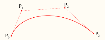
Note that the curve begins at P0, heads towards P1, then arrives at P3 coming from P2’s direction.
注意这条曲线从 P0开始,切线指向 P1,然后结束在P3点,切线背对 P2。
s <x1> <y1> <x2> <y2> <x3> <y3> .. <xN> <yN> - Cubic b-spline
Draws a cubic (3rd degree) uniform b-spline to point N. This must contain at least 3 coordinates (and is, in that case, the same as b). This basically lets you chain several cubic Bézier curves together. Check this other article on Wikipedia for more information.
画一个到 N 点的 cubic b-spline。它最少要包含三个坐标点(这种情况下和 b 相同)。这基本上是把几个贝塞尔曲线连接到一起。请参阅维基百科获得更多信息。
p <x> <y> - Extend b-spline
Extends the b-spline to x,y. This is essentially the same as adding another pair of coordinates at the end of s.
把 b-spline 扩展到 (x, y),这本质上相当于给 s 追加一个坐标点。
c - Close b-spline
Closes the b-spline.
闭合 b-spline。
Note: The vector clip visual typesetting tool only supports the m, l and b commands, and may corrupt drawings which use the other commands.
注意: vector clip visual typesetting tool只支持 m,l,b命令,并且对于其他命令可能会绘制错误.