Font hinting and you
Posted November 29, 2008 by jfs ‐ 3 min read
… or why you should not use animation on the \fs override tag.
Do you know what font hinting is? If you haven’t worked with digital typography you might not, but it’s a technique used by (almost) all font rendering systems to make vector fonts (such as True Type, Open Type and Adobe Type 1) appear better on low-resolution mediums like computer monitors. (Actually CRT TV screens are even worse.)
Usually glyphs (“characters”) in outline fonts have quite some detail in them, but if you only have 7x13 pixels to render a character in, you’re going to have a hard time fitting all that detail in, even if you use sub-pixel rendering such as anti-aliasing and ClearType. That’s where font hinting comes it. It’s a technique for intelligently modifying the outlines of characters so they look better without completely losing the characteristics that makes the font face special. The basic idea in font hinting is to snap the outlines to the edges of pixels, such that stems and vertical lines take up a whole number of pixels instead of disappearing in quantisation or become a smudge of sub-pixel noise.
So what does that have to do with subtitles? Well, the amount of hinting applied to a glyph depends on the point size of it. The bigger the point size, the less strong the hinting needs to be. For example, here’s some text in Verdana at different sizes:
Depending on your font rendering system it might look different (eg. Windows and Macintosh OS X render quite differently) but at least if you’re on Windows you should be able to see that the shapes of the letters actually change a bit. The smaller the text size, the more drastic the change.
It’s this change of glyph shapes that’s interesting in subtitle context. If you’ve ever needed to have some text change size on screen in ASS subtitles you might have considered whether you should use \t(\fs) or \t(\fscx\fscy). It’s the latter that’s correct. When you animate the \fs tag you’re changing the actual font size requested of the font subsystem, and this also affects the hinting applied to the text.
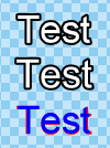
This leads me to the image at the start of this post: Both of the top two lines with “Test” are rendered in what should have been Arial size 40. But the upper has been given its size with \fs1\fscx4000\fscy4000 while the lower has been given its size with \fs40\fscx100\fscy100. Because VSFilter internally works at 8 times resolution, the upper line is requested as Arial with a font-height of 8 pixels, so it’s hinted to look best when rendered just 8 pixels tall, while the other line is requested as 320 pixels tall Arial. The red/blue at the bottom are the same two lines with the border removed, then laid over each other.
Do you now see why you shouldn’t animate the font size, but rather the font scale?